
Case Study
Dashboard redesign that secured a multi-million dollar contract renewal and unlocked further client sales
8 min read
The brief
Design a product to help a global financial consulting firm win and retain clients, as part of a multi-million dollar contract negotiation.
The problem
- Consultants were losing pitches. The product looked dated and forced a slow, manual workflow
- Trustees (non-finance professionals managing pension funds) had no direct access to portfolio data and relied on consultants to explain everything
- During market volatility, consultants were fielding hundreds of repetitive client questions instead of doing strategic work
Key methods
- Thematic coding and analysis
- Collaborative ideation across three concept directions
- Iterative high-fidelity prototyping
- Client co-design: direct sessions with senior client stakeholders across 10+ meetings
- Design system development
- Information architecture redesign
- Developer collaboration: standups, edge cases, build constraints
My role
Joined after user interviews were completed. Conducted thematic coding and analysis in Dovetail, then co-led ideation across three concept directions. Designed all high-fidelity prototypes and presented them directly to senior client stakeholders. Took sole responsibility for design and all client-facing work when the researcher's contract ended. Embedded in the development team post-handover: attended standups, resolved design questions, and designed for edge cases. Identified a scaling bottleneck independently and redesigned the configuration architecture without being asked.
Key tools
Delivered
- High-fidelity prototypes used to win a major client contract before the product was built
- Modular dashboard consultants could configure and present live in client meetings
- New design system
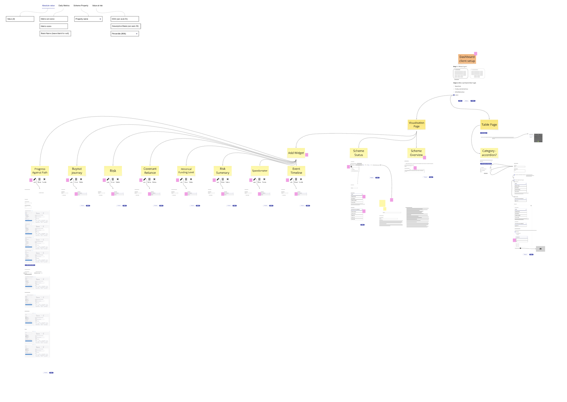
- Configuration editor redesigned: consultants can build dashboards without developer support
- Product white-labelled and sold to multiple additional clients
The problem
The brief was to improve the UI. Interview analysis showed the workflow was the real problem
Consultants exported static models, reformatted them manually per client, and presented from slides. Trustees had no direct portfolio access and relied entirely on consultants to interpret their data. During volatile markets, trustee questions multiplied and the manual workflow broke down completely.
The brief was to improve the UI. The real opportunity was to fix how both sides worked together.
Research
Thematic coding across recorded interviews surfaced two users with incompatible needs
I conducted thematic coding on all recorded interviews in Dovetail, working through sessions independently before consolidating with the researcher. I tagged findings by theme as they emerged across participants, adding more specific tags and comments as the analysis progressed. This meant that when grouping findings by theme at the end, I had the full context of each insight without having to re-read source material.
Two things became clear:
- Consultants held all portfolio information. Trustees were entirely dependent on them to interpret it.
- The product helped consultants with calculations. But it didn't help them deliver that work to trustees. It wasn't capturing the full workflow and forced dependency.
- During volatile markets, trustee questions multiplied and the workflow broke down.
The problem wasn't the UI. It was the dependency the product was built around.
"Trustees call with basic questions during volatile markets"
What that meant
No direct access to live data means consultants are the only channel
"Consultants reformat the same data manually for each client"
What that meant
No standardised output tool means every pitch is built from scratch
"Trustees kept forgetting what metrics meant for their portfolio"
What that meant
Charts show data but don't explain context
Ideation
Analysis produced three concept directions. I mapped what each would need to work, then designed them
After consolidating findings, I mapped each concept in detail: what it would need to include to address the user needs from research, what the dependencies were, and what the trade-offs looked like. I designed initial versions of all three before the team aligned on direction.
Presentation Tool Deprioritised
- Allowed for the presentation of interactive charts to aid in explaining concepts
- Similar to an existing tool called Journey Planner which I was asked to redesign rather than build new
- Deprioritised when the dashboard concept proved more versatile, covering higher-frequency client interactions with live data
Pitch Partner Cut
- Inspired by research: trustees felt uncomfortable asking questions during pitches and didn't always understand the financial concepts being presented
- A dual-interface mobile tool: consultants controlled the presentation, trustees followed along and could ask questions without interrupting
- Cut when regulatory restrictions on consultant-trustee communications made the concept legally uncertain
Interactive chart during presentation & ask question option
Modular dashboard Pursued
- Addressed the ongoing relationship after a client was signed
- Research showed consultants were doing significant manual work to communicate portfolio data, and trustees had no direct access
- A configurable live view consultants could present in meetings solved both problems
The design decisions and process that built a successful final product
Key design decision — 01
Initial concept cut. It removed consultant ownership of the meeting
The first prototype used AI-powered natural language queries so trustees could explore portfolio data themselves. It removed the consultant's ability to control the narrative. Feasibility was also a problem: the dev team couldn't deliver it. Cut early.
Design iteration — 01
Basic display of key metrics
Each data point as a separate bar chart. Clear data, but an overwhelming wall with no sense of how metrics related or changed over time.
Design iteration — 02
Showing change over time but not translating the metrics
A consistent bar chart showing change across three key dates against a benchmark, applied to every metric. Repetitive and still hard to scan. We already had a table view doing this job.
Design iteration — 03
Forgetting the data and focusing on trustee needs
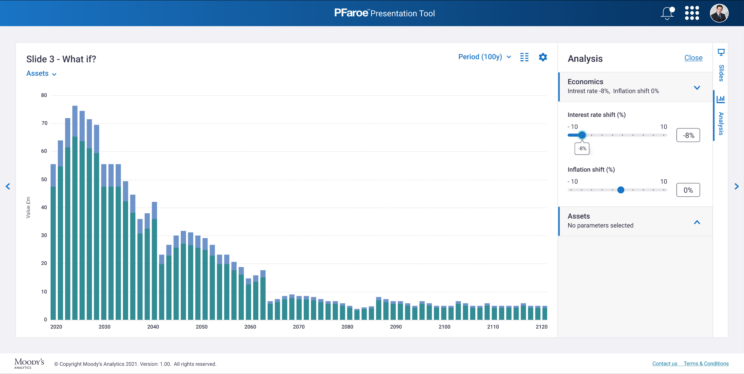
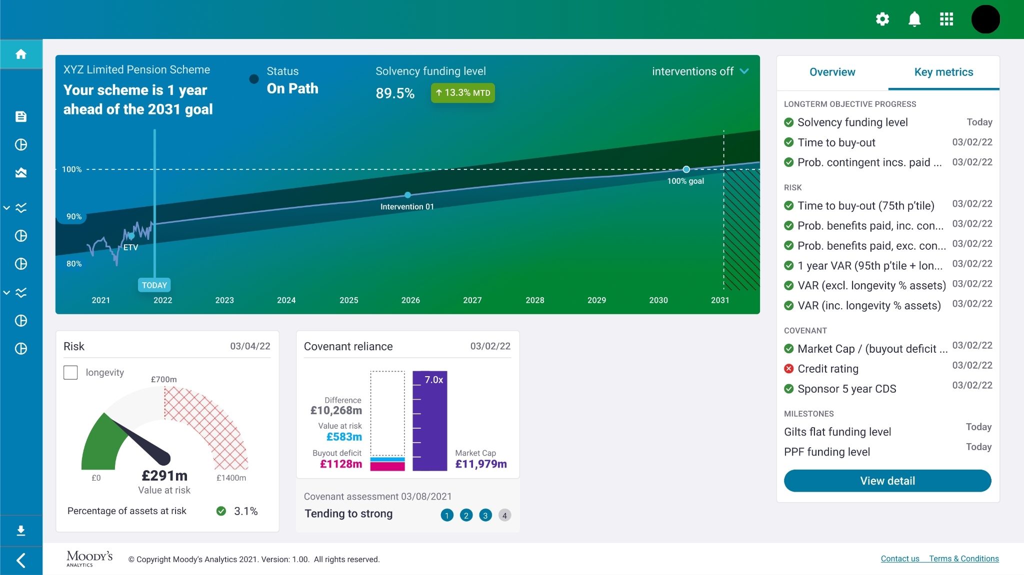
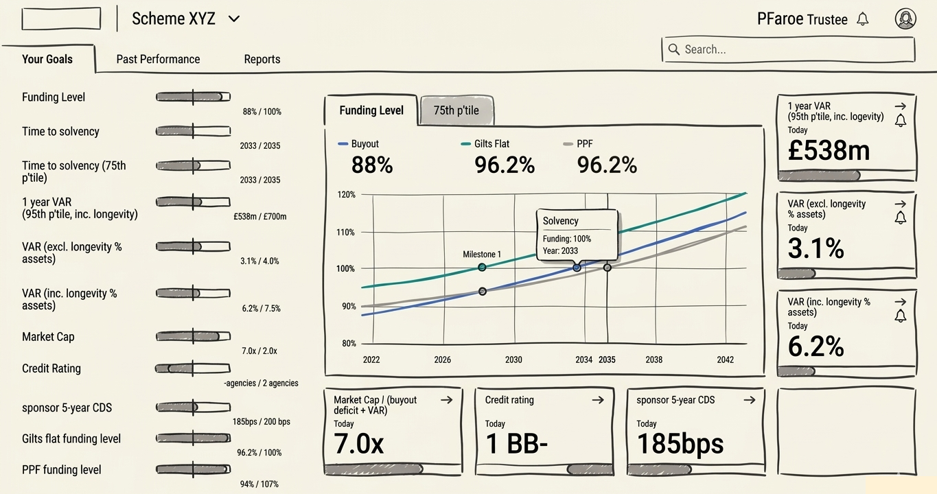
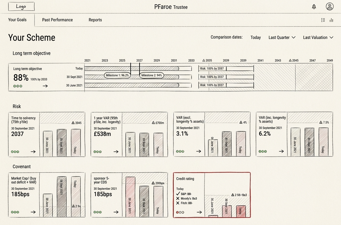
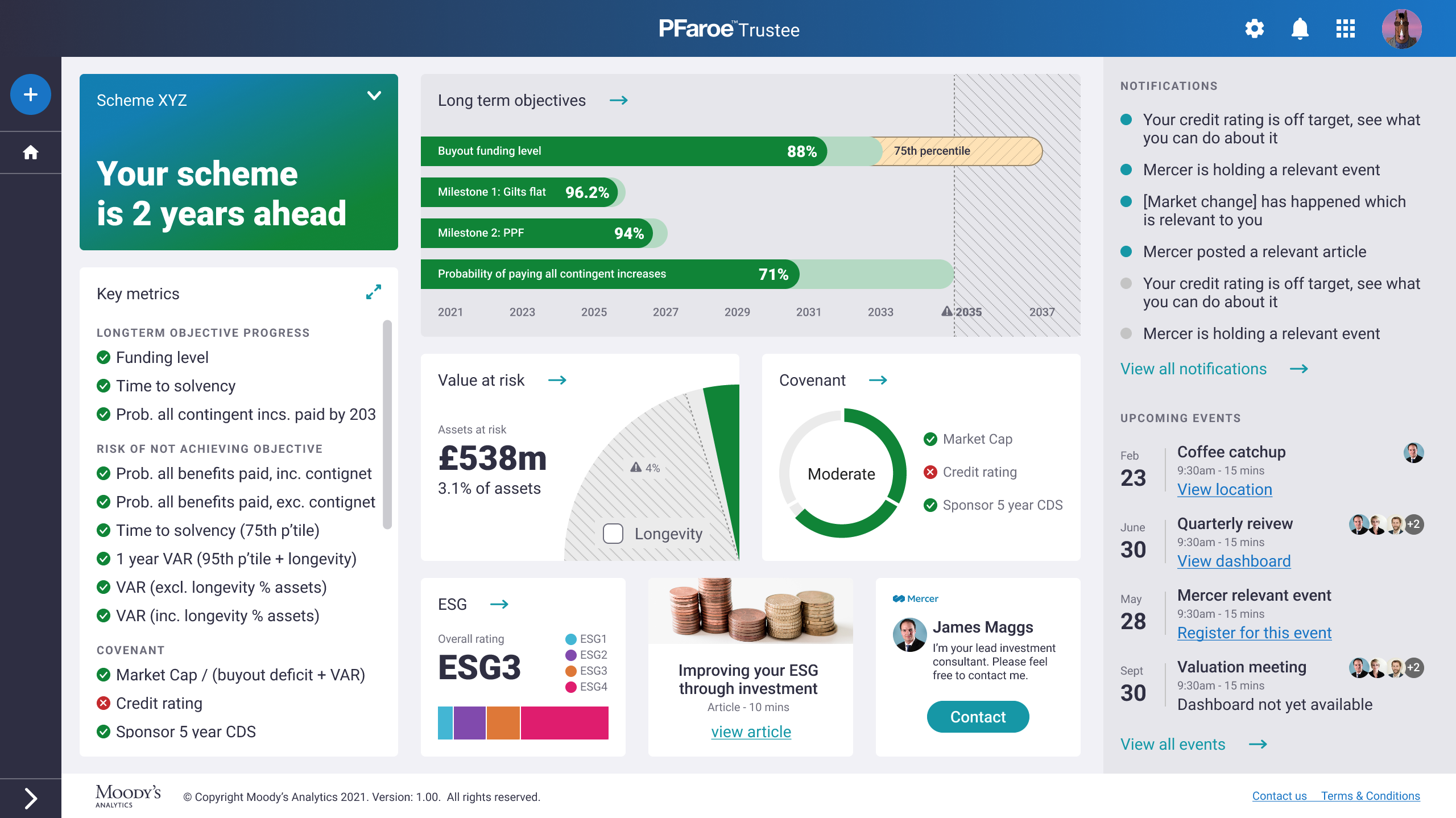
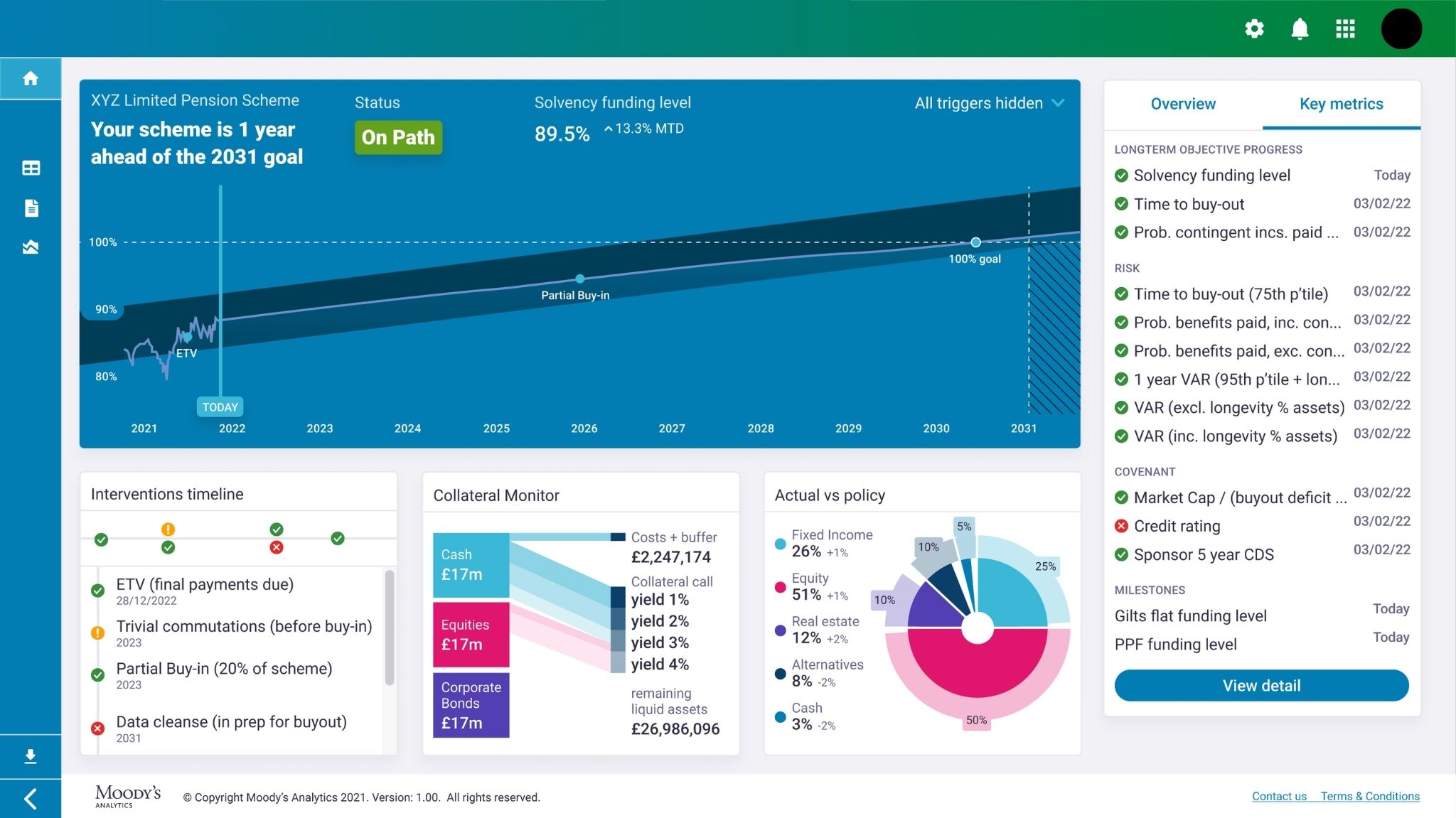
Stepped back and asked what trustees actually needed to understand about their portfolio. Reorganised the dashboard around that. Each metric got a chart type suited to its data. Started with a portfolio health overview, then long-term objective tracking, then supporting data. Notifications and a calendar were removed after client feedback: too much manual input to maintain. A projection chart replaced it. This became the foundation for the final design.
Key design decision — 02
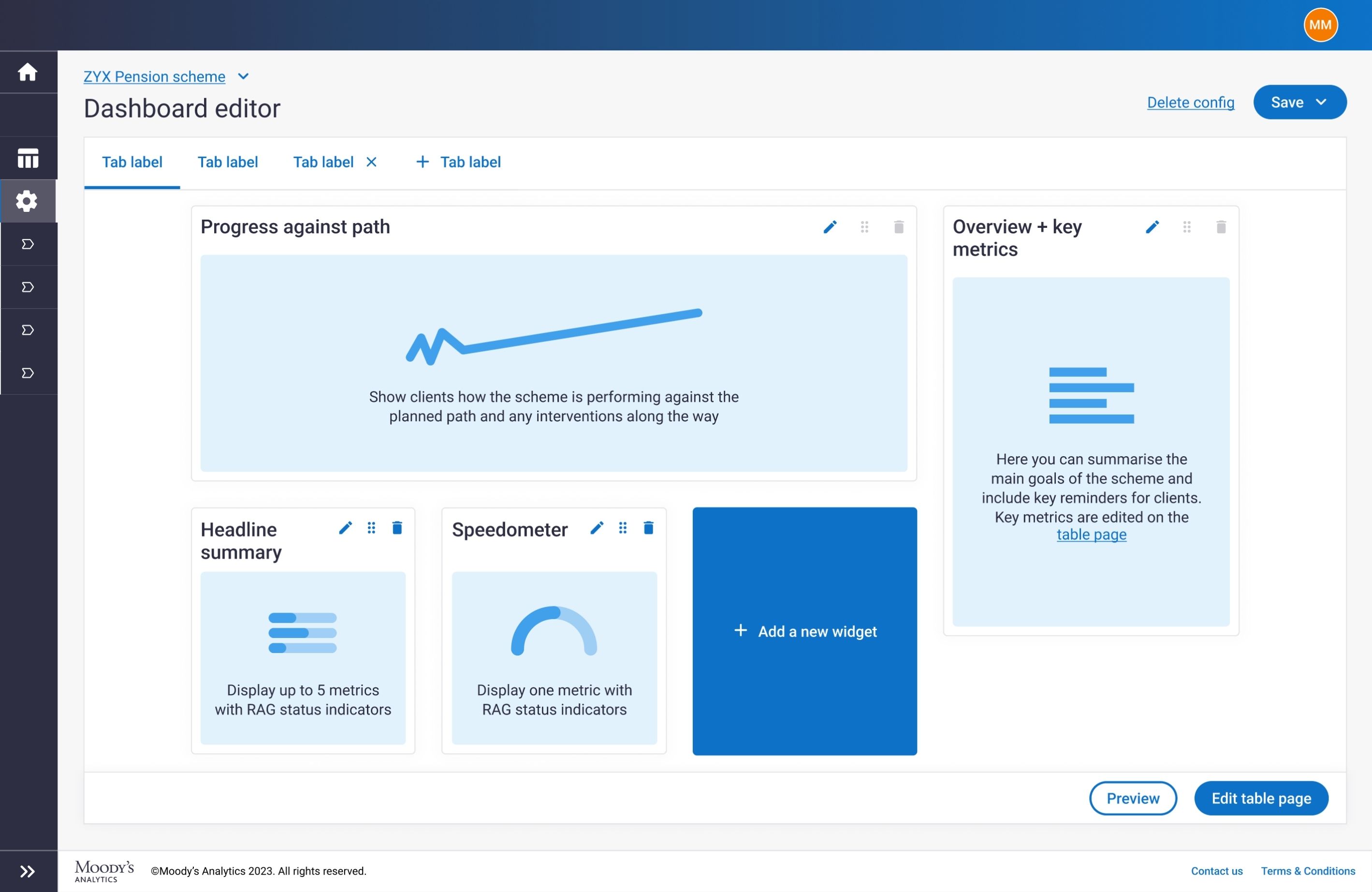
Modular dashboard: consultants configure the right view for each client
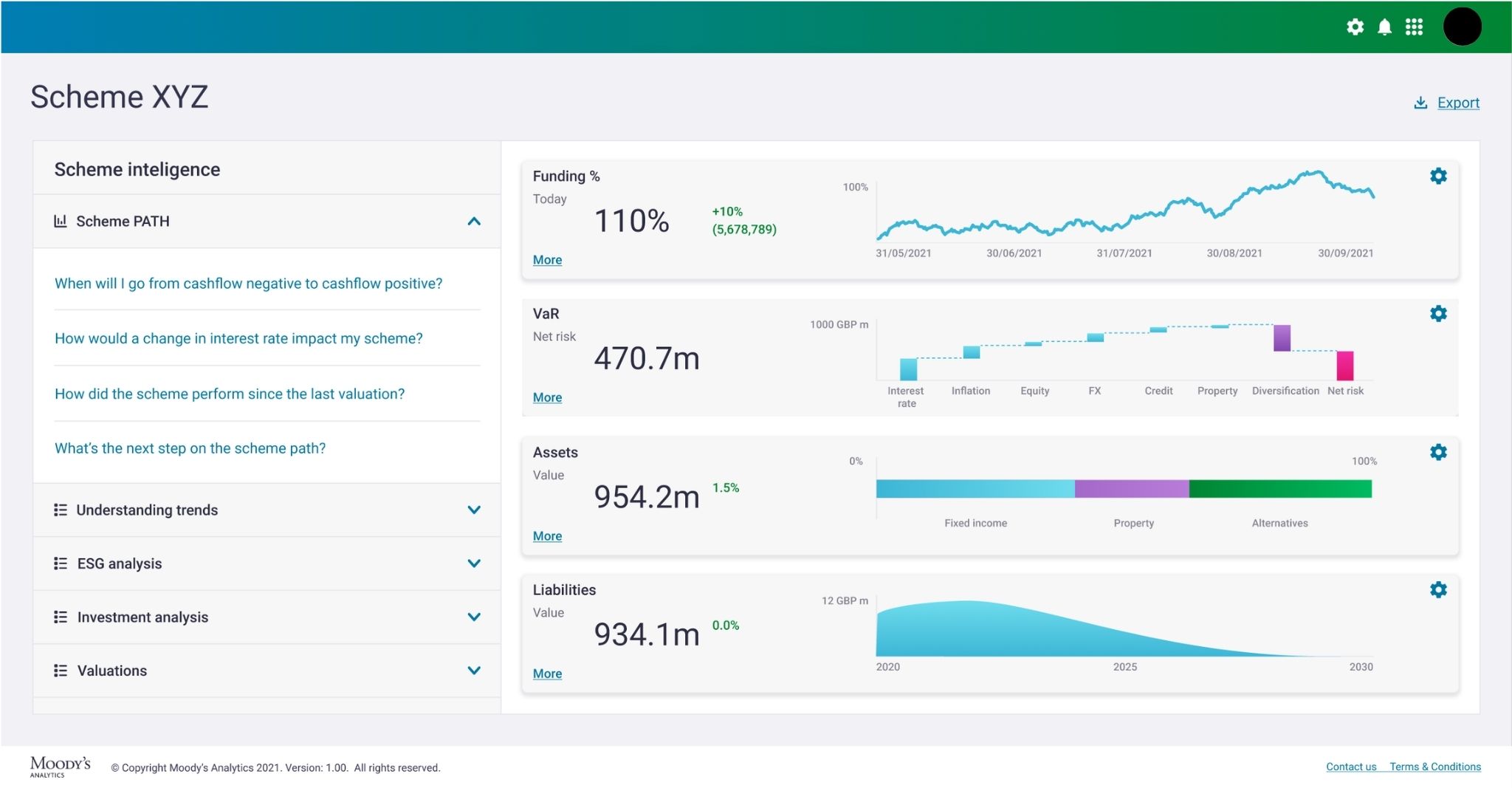
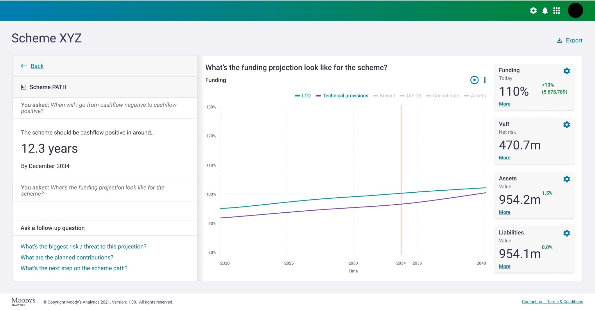
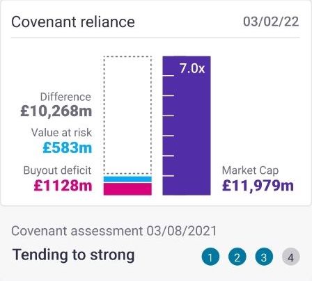
Consultants select which modules to display and the financial data within them. Each module is designed to combine related data points to contextualise them for trustees. I co-designed the specific chart content directly with the client across more than ten sessions, validating which data and visualisations gave trustees meaningful understanding of their portfolio. Consultants can now present live from the tool, changing the dynamic of both pitches and ongoing client meetings.
Key design decision — 03
Charts designed so trustees could follow without consultant explanation
RAG status and key metric callouts give trustees immediate visibility of portfolio health. Charts combine related data points to show what they mean in context, not just the numbers.
Key design decision — 04
New design system rebuilt credibility without abandoning the brand
The existing system wasn't shifting perceptions with trustees. I built a new one: modern enough to change how the product was perceived, consistent enough with the existing brand to feel like the same product. The client used the prototypes in a pitch and won a contract with Rolls Royce.
Commercial outcome
The client used the prototypes to win a major contract before a line of code was written
The high-fidelity prototypes were presented directly to senior client stakeholders across more than ten sessions. Before the product went to development, the client used those prototypes in a major pitch. They won a contract with Rolls Royce.
Having committed to delivering the tool to Rolls Royce, the client re-signed with Moody's. The Moody's sales team used the same prototypes to sell the product to additional clients. The product was then built and white-labelled for each.

Going above and beyond
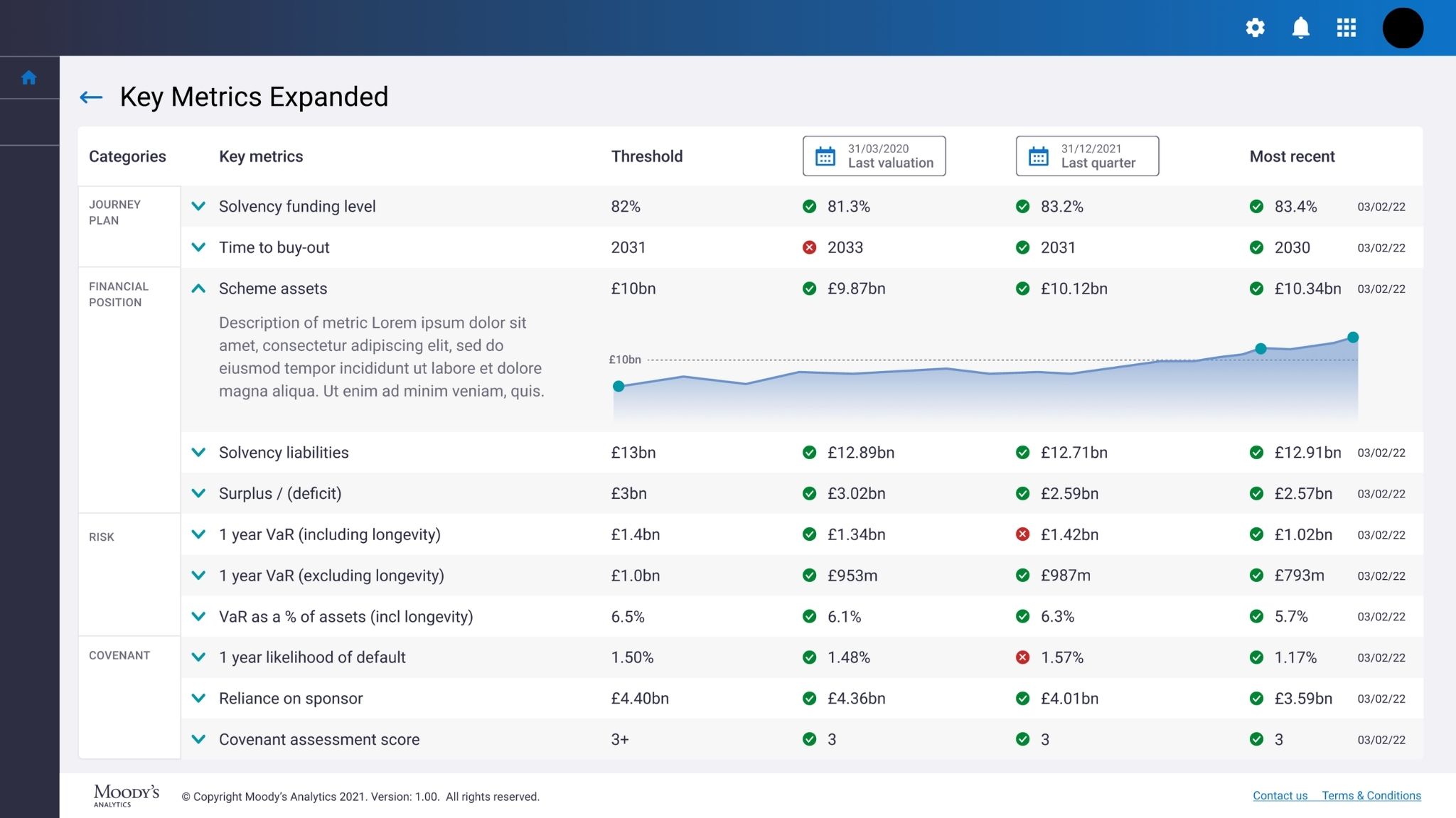
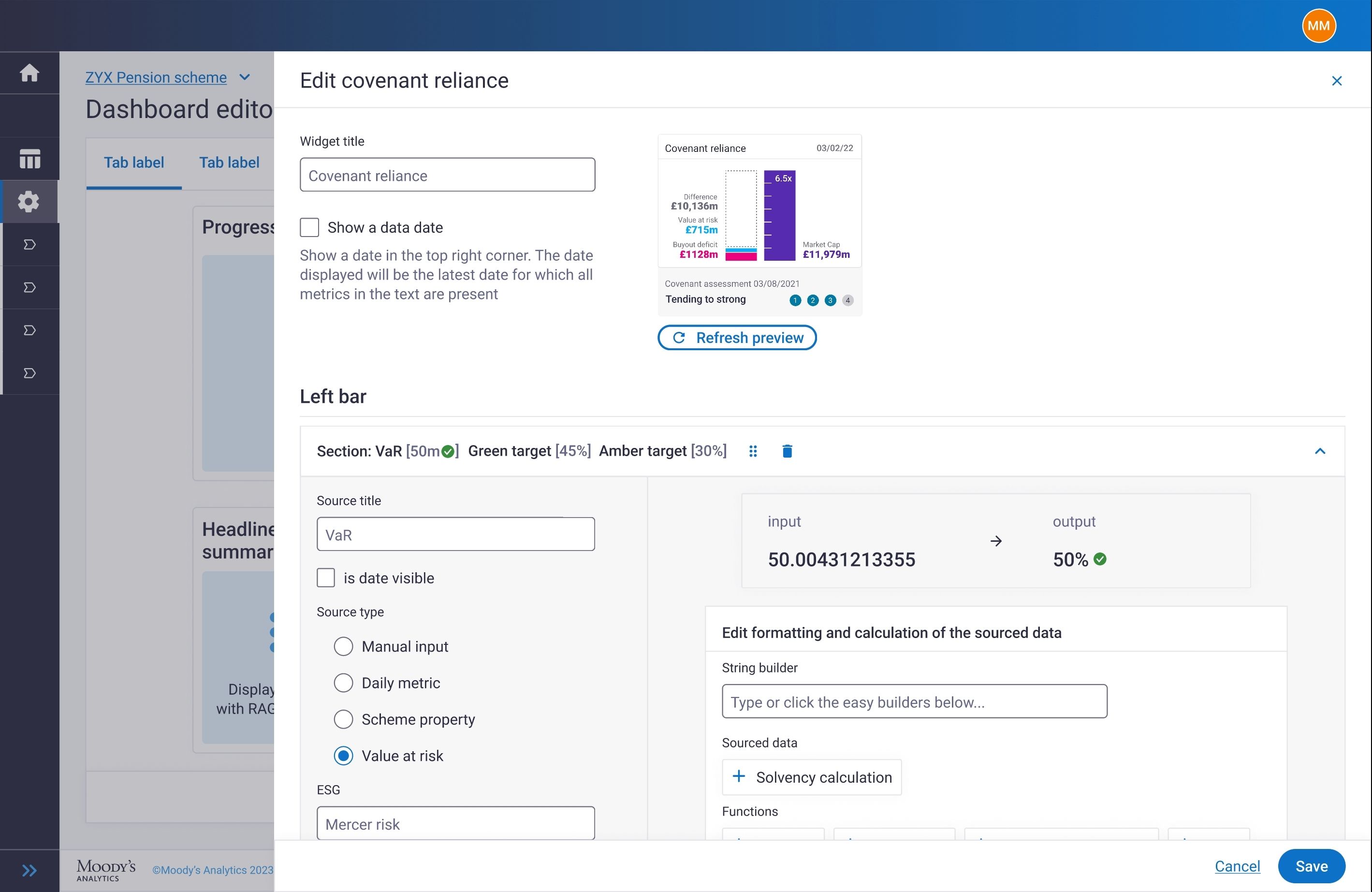
Identified a scaling bottleneck and redesigned the configuration architecture to remove it
The dev team had built a backend tool to make dashboard setup faster for themselves. It was difficult to navigate, with inconsistent form inputs that varied for each data type. Every new client dashboard required manual developer setup. As the sales team sold to more clients, development capacity was going to break under that demand.
I mapped the existing configuration architecture through conversations with the dev team, understood what each element did and where it could be consolidated, and redesigned the structure independently. I translated it into a high-fidelity interactive prototype, using progressive disclosure to handle complex inputs without overwhelming the user. I presented to the dev team, iterated on anything too complex to build quickly (documented as ideal future state), and handed over a configuration editor that consultants could operate without developer involvement.
No one asked for this.
Results
The designs secured a contract renewal and drove new client sales before the product was built
High-fidelity prototypes used by the client to win a Rolls Royce contract before the product was built
Multi-million dollar contract renewed at an increased rate
Product white-labelled and sold to multiple additional clients
Development bottleneck removed: product can now scale with new client demand
Promoted from contractor to permanent employee
Next steps
How I'd validate further
- Usability test: can a consultant build a pitch-ready dashboard without developer support within a target time?
- Trustee comprehension test: can 5 non-specialists explain key portfolio metrics unprompted?
- Sales cycle win rate before and after rollout
Post-launch, feedback arrived only through customer support. I pushed to implement analytics on the dashboard but couldn't get it prioritised. The absence of a structured feedback loop is the largest gap in this project.