Case Study
End-to-end redesign that resolved a trust problem driving low pledge completions for Protect Our Winters
7 min read
The brief
Identify why Protect Our Winters' (POW) climate pledge had a low completion rate and high support volume, and redesign the experience to address it.
The problem
- POW assumed the form was broken
- Google Analytics showed an 80% bounce rate on the homepage: users were leaving before reaching the form
- Research confirmed they didn't understand who POW was, what they were committing to, or that a payment would be required
Key methods
- Google Analytics and Hotjar analysis
- Stakeholder workshop, proto-personas and customer journey mapping
- Accessibility audit (WCAG): WAVE, headingsMAP, Accessibility Insights for Web
- Heuristic evaluation
- Hybrid usability testing
- Affinity diagramming and ideation workshops
- High-fidelity prototyping
- Design system development
My role
Led UX strategy and coordinated a remote team of 6 volunteers. Responsible for accessibility auditing, research facilitation, thematic analysis, ideation workshops, high-fidelity prototypes, and design system development.
Key tools
Delivered
- Full website redesign which is still live today
- Pledge form with qualifying questions and stepped structure
- New design system
- Support requests reduced
The problem
Analytics pointed to the homepage. Not the form
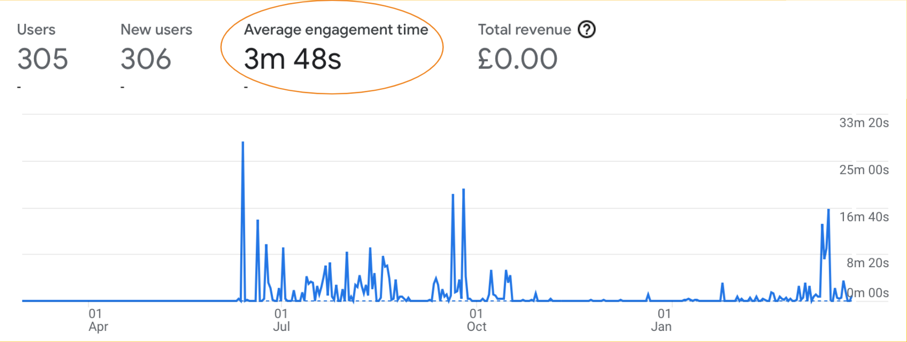
Google Analytics showed an 80% bounce rate on the homepage, with average session engagement under 4 minutes. Hotjar confirmed drop-off was on the homepage, not the pledge form.
Usability testing explained why: most participants couldn't describe POW's mission, what they could do on the site, or what the pledge was for. Their trust was then violated when a paywall appeared after the entire form was completed.
Fixing the form without addressing the trust gap would have changed nothing.
Research: analytics
Analytics established where users were dropping off
Google Analytics showed an 80% bounce rate and average session engagement under 4 minutes. Hotjar recordings confirmed drop-off on the homepage, well before users reached the pledge form. This established the homepage as the primary problem, not the form.
Research: stakeholder workshop
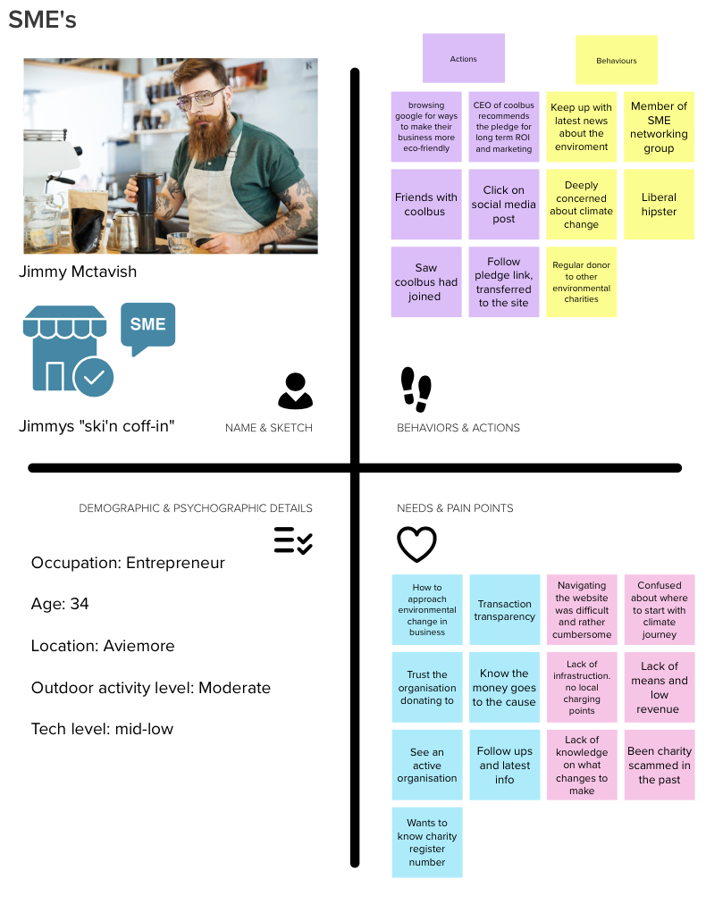
A stakeholder workshop produced proto-personas and a customer journey map
Working with POW's team, I facilitated a workshop to build proto-personas from existing knowledge and map the likely user journey. The journey map traced an SME entrepreneur from first contact through pledge completion. It revealed a consistent pattern: confusion about POW's identity early, information overload at the form, and a payment discovery at the end that undermined everything that came before it.
Research: accessibility audit
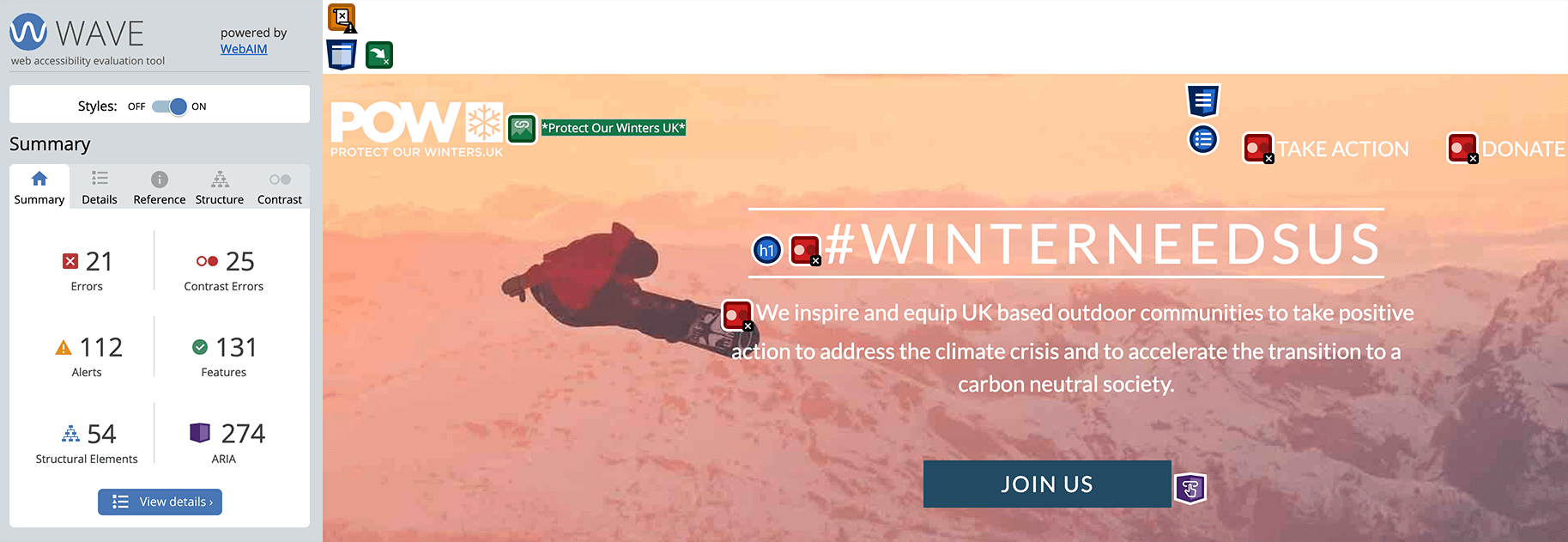
The accessibility audit found the site failing on foundational standards
Using WAVE, headingsMAP, and Accessibility Insights for Web, I audited the site against WCAG guidelines. Key failures:
- Heading structure was muddled and inconsistent, breaking screen reader navigation
- Multiple images were missing alt text
- Text contrast was insufficient across most of the site
- Keyboard navigation was broken in several areas
- Embedded forms on the donation page did not work with assistive technology
Research: heuristic evaluation
193 heuristic violations. The site's CTA hierarchy was invisible to users
I led a heuristic evaluation of the home and pledge pages across the full team of 6, with each page evaluated independently and results cross-referenced to reduce bias.
193 violations in total. The most common: consistency and standards, match between system and the real world, and minimalist design.
The clearest example: important CTAs were styled as inline text links, barely distinguishable from body copy with no underline or decoration. The button hierarchy existed in the design system but wasn't applied. Users had no reliable signal for what to click.
Research: usability testing
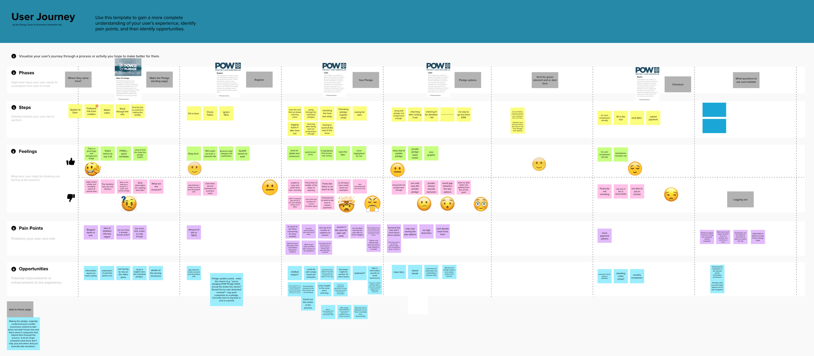
5 participants. None could explain POW's mission. Most couldn't complete the pledge
We ran a hybrid study combining think-aloud tasks with interview questions. I organised and led recruitment alongside a teammate. Five participants, 6-person team involved across facilitation and analysis.
Key observations:
- No participant could describe POW's mission unprompted after viewing the homepage
- A sustainability manager (a target user) could not complete the pledge unaided
- Participants scrolled to gauge how much of the form remained before completing a single field
- Finding the payment requirement at the end produced visible frustration across every session
"At first glance it seems a bit too much really."
"The pledge is convoluted and a lot of the questions are irrelevant. It should be simpler."
"It's not clear to me whether this is for an individual or a business."
Research: synthesis
Affinity diagramming distilled all findings into four themes that directed the design
I ran an affinity diagramming workshop with three teammates to cluster insights from across all research activities. Four themes emerged:
- Lack of clarity and transparency was creating confusion and mistrust
- The pledge felt overwhelming and confusing
- Users couldn't identify how to get involved with POW
- Users wanted more encouragement and connection throughout the process
Key design decision 1
Homepage redesigned to establish trust before users invest any time
We redesigned the homepage to communicate who POW is, what the pledge involves, and that a payment is required, before a user invests any time. Users who now reach the form do so with accurate expectations.
Key design decision 2
Qualifying questions reduced form length before users saw a single field
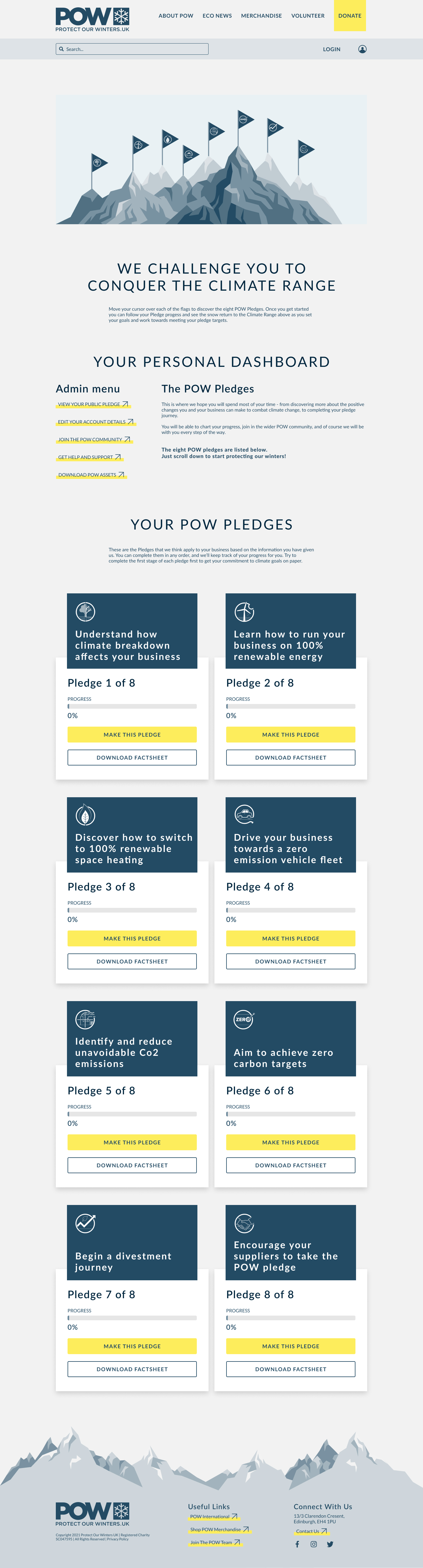
The original form showed every field to every user regardless of relevance. Qualifying questions at the start remove irrelevant fields based on organisation type and more. So, every user sees a shorter, more relevant form immediately.
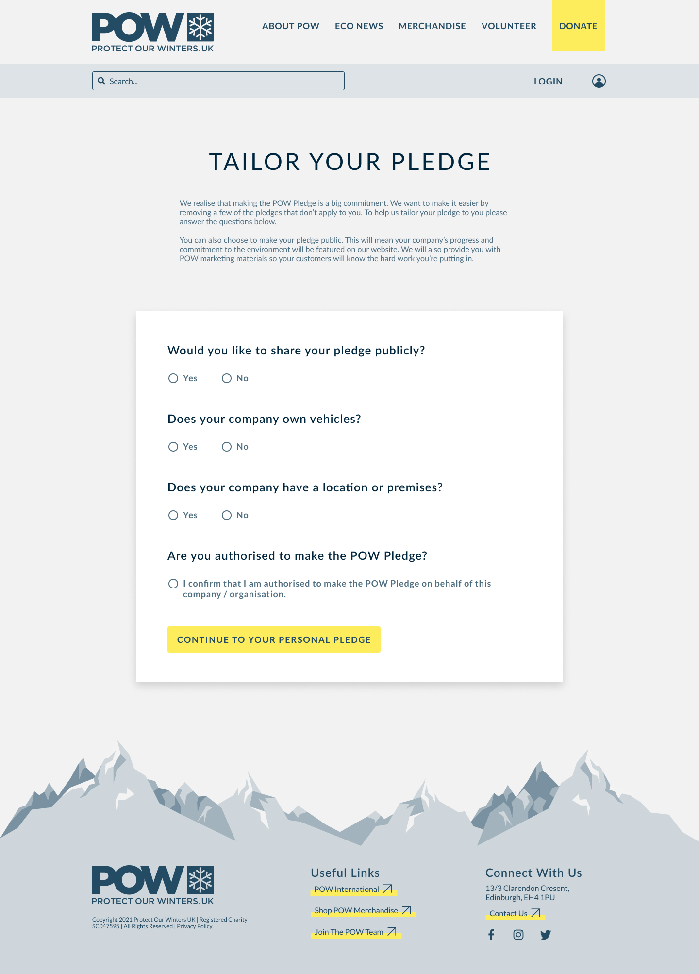
Key design decision 3
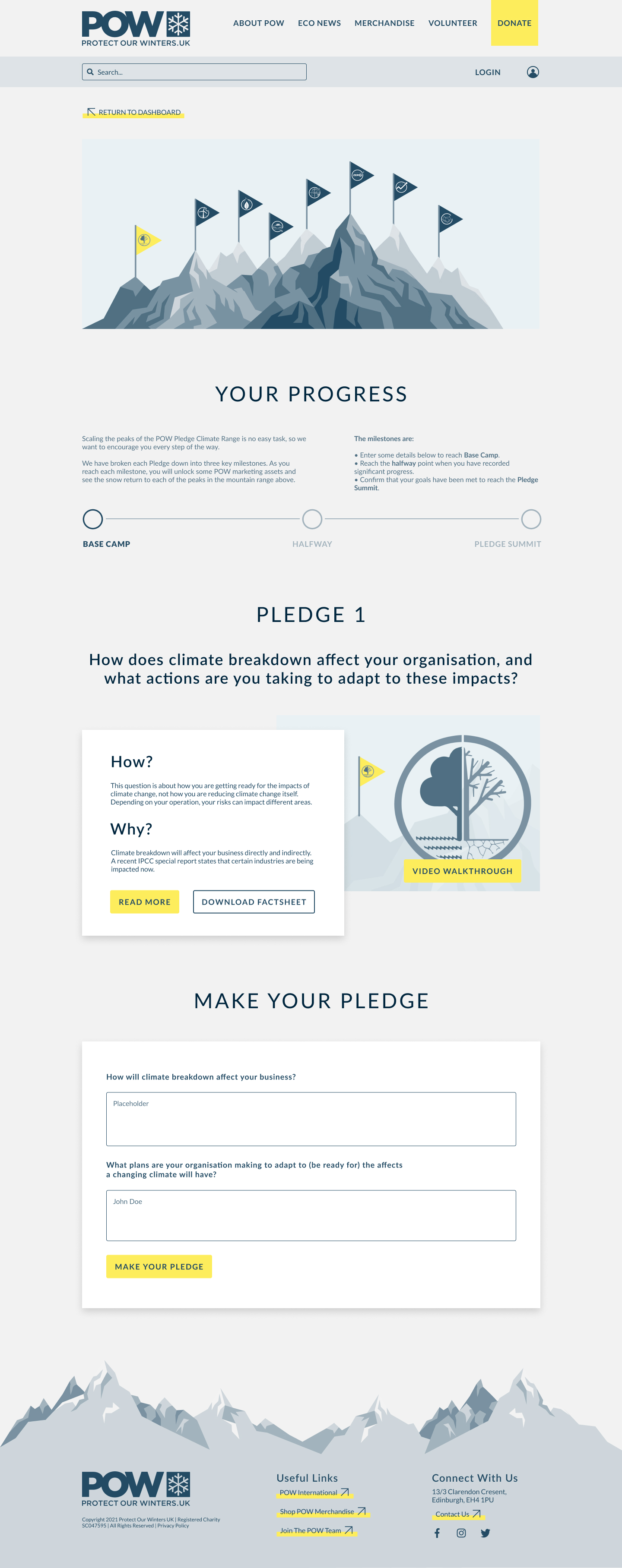
Stepped structure made the full form feel completable
The form was broken into clear, sequenced steps with progress indicators and brief introductions. One participant described the original as "a bit too much really" at first glance. The redesign addresses that directly.
Results
The redesign is still live. Still working.
"The whole website we are still running is what was built with during the project and is working really well for us. Everyone seems able to find the information they want."
— Head of Policy and Advocacy, Protect Our WintersWebsite still live, in active use today
Clarity and findability of information improved
Support requests reduced
Next steps
How I'd validate further
- Google Analytics funnel tracking, drop-off at each stage before and after
- Hotjar session recordings to identify remaining friction
- 5-second mission comprehension test. Targeting 80% correct unprompted